Instructions for prepress files
Basic instructions
- Material should be supplied as .ai, .indd, or .ap files at 1:1 size
- A colour printout or PDF file should be included
- Texts should be included in converted and unconverted versions:
- unconverted (all fonts included)
- converted (text converted to graphics)
- All elements should be modifiable in terms of size, colour and shape. All external elements should be included.
- If the original file is a PDF, we must be able to open it in Illustrator or ArtPro.
- Please note in colour separation:
- images should be modified using Photoshop
- colour separation must be CMYK not RGB
- separations should have high contrast in respect of both grey level and hue
- a minimum of 300 ppi should be used
- Location and size of photocell mark should be specified.
- Printed and non-printed areas and folding lines should be marked clearly.
- Please note:
- Transparent film requires a white base colour under the printed areas.
- White pigmented film will provide a better base for half-tone images than white colour on transparent film.
- A white base is essential for lamination work, and should be taken into account when specifying the total colour count.
Send the design to our repro departments:
Finland
repro.tampere@amerplast.com
Poland
repro.grodzisk@amerplast.com
Design instructions
Design instructions for flexo printing
Start the planning of artwork by test packing the product(s) concerned. This makes it easy to check dimensions and how printed areas and seams will look in the final packaging. Changes made to dimensions during the proofing phase will increase costs.
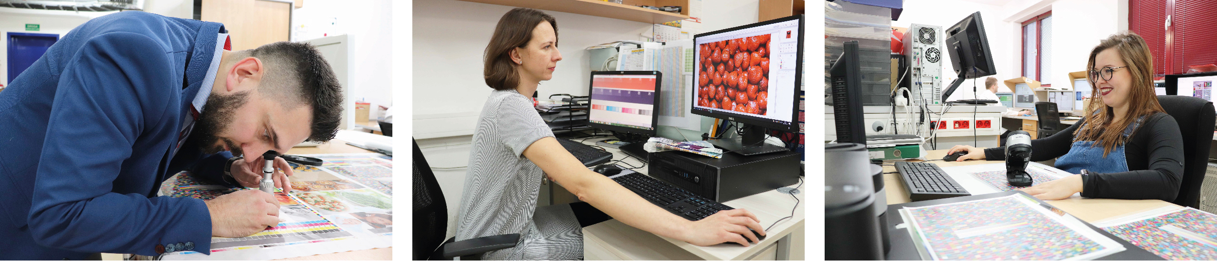
A high-quality printing result requires professional prepress work. A good understanding of flexo printing techniques can help achieve optimal colour separation and overall quality. We prefer to carry out colour separation ourselves to guarantee a good end-result. The potential for making changes and corrections when a job is being printed is limited.
General guidelines
- When printing a specific area or element with spot colours, use PMS codes to specify colours, rather than 10/75/20/5 or 100 %C+30%M for example.
- The recommended rulling for raster areas are between 20-60L/cm, depending on the product, size of the image, and/or printing machine.
- Gradients ranging from 2-98 % can be printed.
- Rasters should be continuous, using a minimum dot size of 2 % in the lightest areas
- Dot gain is typically high and this needs to be taken into account during prepress.
- Trapping (colour overlap) is normally 0.2 mm.
- 5 mm of unprinted space should be left around the edges of bag-type packaging.
- Logos and shapes should be of high quality, preferably in the form of vector graphics.
- Avoid using PC-based files, as converting files can corrupt artwork, including even simple line art.
EAN codes
- The location of EAN codes should always be specified. Bars should be parallel to the printing direction.
- Sufficient place should be allowed for EAN codes and they should be aligned correctly. Bars should run parallel to the printing direction. In bags, they should run from seam to seam, and in reel products, in the winding direction.
- The size of EAN codes should be 1.00-1.20, depending on the product and printing press used. 1.00 = 37.29 x 25.93 mm for EAN13.
- A minimum of 3.63 mm space should be left after an EAN code printed at normal size. If this is not done, the code will be illegible.
- EAN codes should not be printed in red, red-brown, or pale colours, as red laser readers cannot detect these colours.
Raster images
- Originals should contain as much contrast as possible, both in terms of hue and grey level, as printing reduces contrast.
- Image files should be linked not embedded.
- The minimum resolution for colour separations is 300 ppi.
- Do not rasterize small lines or text.
- Avoid using text set at small point sizes, both negative and positive, in rasterized areas.
- Shadows are generally produced using black only.
Line art
- PMS colours should be printed as spot colours if high levels of colour accuracy are required. Otherwise use CMYK colours.
- Small positive text should be set at a minimum size of 5-8 pt, depending on the font used.
- As it is difficult to keep small negative text legible, this should be set semi-bold at a minimum size of 6-8 pt, depending on the font.
- A white base should be printed under other colours, including black, when printing on transparent materials, unless otherwise agreed.
- A white base should be printed or not printed under a photocell mark, depending on the requirements of the packaging and converting line used. This will ensure that the mark can be read from either side, above or below.
- Including white as one of the colours in a design ensures that shapes and contours will be rendered accurately. The best results will be achieved by including white as a separate layer.
- Avoid thin lines. We recommend using positive lines thicker than 0.20 mm wide. Using lines thinner than this risk lines printing unevenly or separating from the plate. Negative lines should be thicker than 0.30-0.40 mm to avoid blocking of the lines.
Designing for maximum cost effectiveness and to allow for subsequent changes
- Packaging for new products can often contain text or element that will be left out later, such as ‘New recipe’. The location and colour of this type of text or element should be designed so that it can be easily removed without affecting other colours.
- It is a good idea to use common areas on packaging for different products in the same family. The same basic artwork can be used by varying product names and descriptions. But remember that this will only work with products of the same size!
- Packaging for products in the same product family can often benefit from using common colours, as this means that it can be printed on the same machine without washing the machine or toning the inks in between.
If you have any questions, please contact our repro professionals.
Finland
repro.tampere@amerplast.com
Poland
repro.grodzisk@amerplast.com